
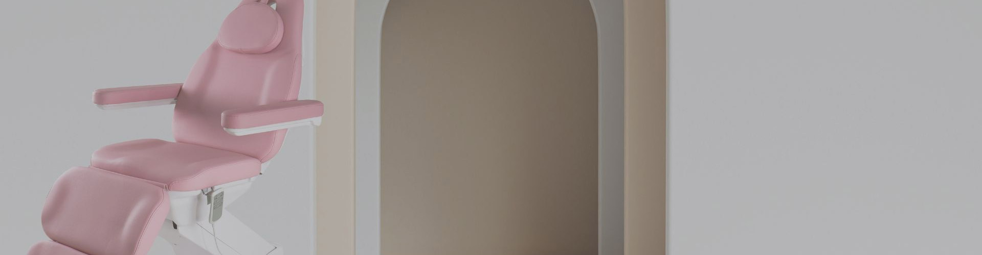
A Malaysia-based med-aesthetic operator was setting up a new studio positioned around skin analysis + device-led facial treatments. Their brand direction was clear: modern, technology-forward, and premium, but still welcoming—they didn’t want the space to feel like a hospital or a cold lab.
Key needs (what we designed around):
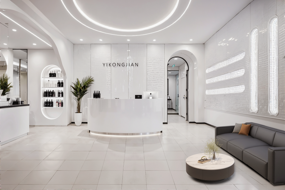
A reception that instantly communicates “medical aesthetics” and supports light retail
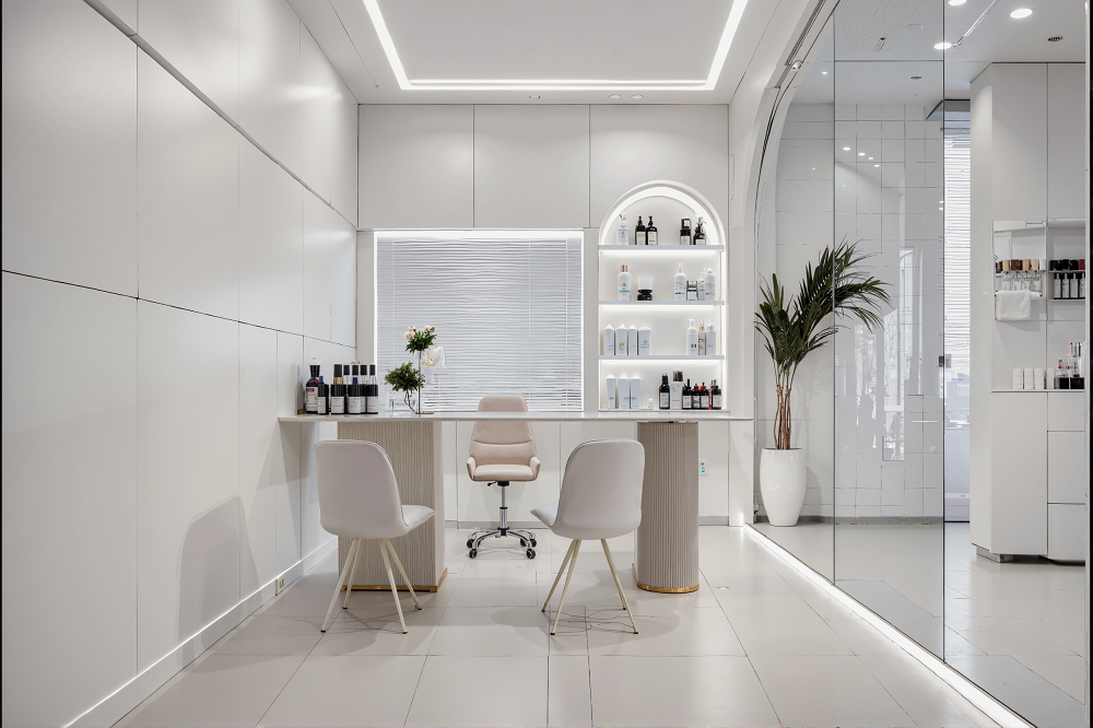
A consultation room that feels professional and private (conversion happens here)
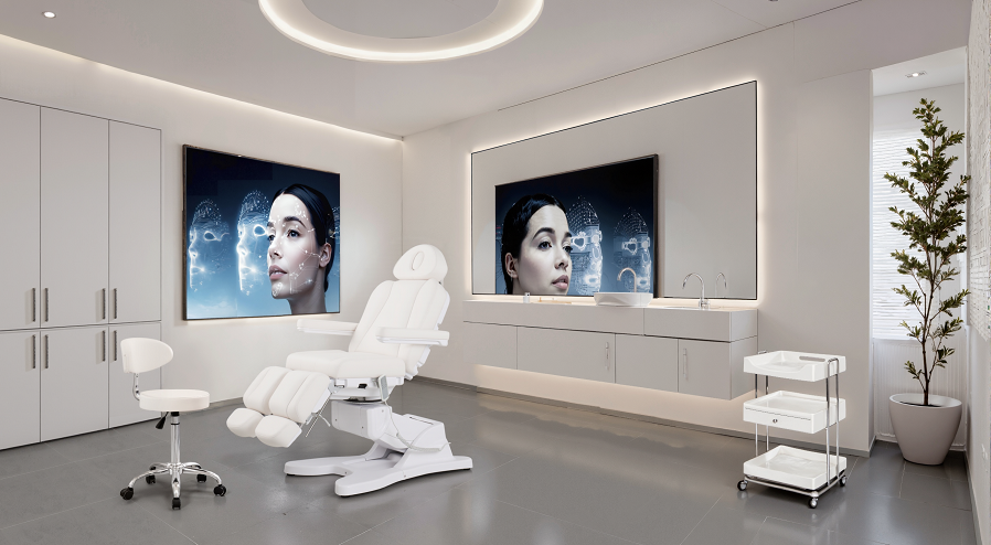
A treatment room planned for device workflow (chair + trolley + storage + sink line)
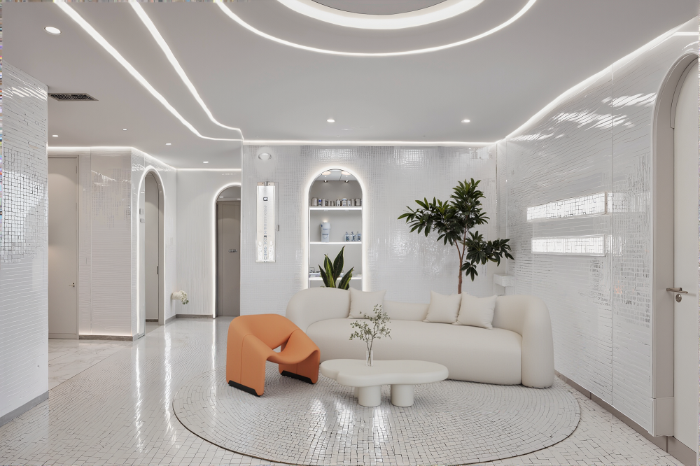
A waiting lounge that reduces anxiety and stays photo-ready during daily operations
We treated this as a branding + operations project, not a styling exercise. The concept is what we call “Soft-Tech Minimalism”—tech cues, but softened through geometry and lighting so clients feel comfortable.
Design decisions that set the foundation
A. Curved geometry as a clinic signature
Arches, rounded corners, and curved feature elements appear in every zone. This does two things in a real clinic:
keeps the environment calm (less “clinical sharpness”), and
makes the studio instantly recognizable as one brand rather than separate rooms.
B. Halo + linear lighting as a system (not decoration)
The ceiling rings and ribbon lines create a consistent tech identity. Under that, we kept the overall brightness even and practical—because med-aesthetic rooms must work for:
face-to-face consultation,
treatment tasks,
content shooting and client photos.
C. White base with layered surfaces (to avoid “flat white”)
We used white as the trust/color anchor, but added depth through gloss, micro-texture, and controlled reflections. The goal was “clean and premium,” not “empty.”
D. Storage-first planning to protect the visual standard
The fastest way a clinic loses its premium feel is clutter: bottles, disposables, cables, devices. We designed storage and work lines first so the space stays clean without needing constant staging.
Reception & Retail Display
Curved reception desk becomes the visual anchor and improves flow at the entry
Illuminated niche shelving supports product display without making the lobby feel like a shop
Branding wall placed in direct sightline from the entry for immediate recognition
Consultation Room
Built for real consult behavior: two guest seats (client + companion), clear tabletop, storage behind
Lighting kept soft and even to support assessment conversations and maintain a calm tone
Treatment Room
Treatment chair positioned for true access on both sides; trolley route and parking considered
Full cabinet + counter + sink line designed as a continuous “work wall” to reduce movement and mess
Visual restraint: clean planes and controlled tech elements so the room reads medical-professional
Waiting Lounge
Lounge planned as an emotional reset zone (not a queue): curved seating, low table proportions
A single warm accent element to keep the white space from feeling cold, while staying on-brand
Below is the kind of practical list we provide so the space can be executed without “on-site guessing.”
Front-of-house
Custom reception desk (curved form, underglow lighting)
Backlit display shelving / niche cabinets (product retail + brand presentation)
Waiting seating set (commercial upholstery, easy-clean surfaces)
Coffee table / décor elements (kept minimal to maintain clean visuals)
Consultation
Consultation desk + ergonomic clinician chair
Two guest chairs (stable, easy-clean materials)
Storage cabinets for samples, paperwork, and devices (to keep surfaces clear)
Treatment
Electric dermatology / facial treatment chair (multi-position)
Clinic trolley (device support + daily tool workflow)
Built-in cabinetry + counter + sink module
Power planning accessories (hidden cable routing, device parking points)
General / integrated
Custom lighting plan (halo ceiling + linear wall lighting)
Integrated wall finishes selected for cleanability and reflection control
Plants/soft elements placed intentionally (warmth without clutter)
For this project, we didn’t stop at making the renders look good. We aligned the spatial language with the furniture/equipment plan, so the clinic feels the same after opening day—when staff are moving fast, devices are in use, and storage actually matters.
If you’re planning a med-aesthetic studio and want a concept that can be built and operated (not just photographed), browse more of our project work here: https://www.dpbeautyfurniture.com/project.html
Or reach out with your floor plan and service list—we’ll help you translate it into a layout, a style direction, and a procurement plan that’s actually executable.


"*" indicates required fields


